Otus Brand Guide
This page is intended to standardized usage guides for the Otus brand. Logos and fonts can also be downloaded in the sections below.
Updated 02/14/2025.
Our Mission, Our Vision, Our Position
Our Vision
Ensure every educator and the school community has the insights they need to make a difference in students’ lives.
.png?width=512&height=304&name=unnamed%20(3).png)
Our Mission
We provide the tools and data educators, students, and families need to monitor and improve performance.
.png?width=512&height=299&name=unnamed%20(4).png)
Our Position
Otus is a K-12 Assessment, Data, and Insights Solution
.png?width=512&height=244&name=unnamed%20(5).png)
Logo
The Otus logo was created in 2015.

DO
The primary preferred usage is Purple on white.
Other light backgrounds may be used as long as legibility is maintained.
Alternate versions are white on Otus Purple or on the Otus Gradients.
.png)
DON'T
Don't add drop shadows or other effects to the logo, change the color, use other background colors, or skew or modify the logo.
Also, don't use on background images or use the logo to create images.
.png)
COLOR
Color has always been an important element to the Otus brand and platform. With purple as the most dominant, a handful of other bright and playful colors make up the rest of the palette.
PRIMARY

Otus Purple
#4C348E
SECONDARY

Light Purple
#805AD5

Teal
#38B2AC

Orange
#F5AB24
ACCENT

Blue
#4299E1

Green
#48BB78

Red
#F56565

Yellow
#ECC94B

Navy
#403E6C
NEUTRAL

Light Green
#DCF0F2

Light Purple
#D7DAFF

Gray
#A0AEC0

Dark Gray
#333333
GRADIENTS
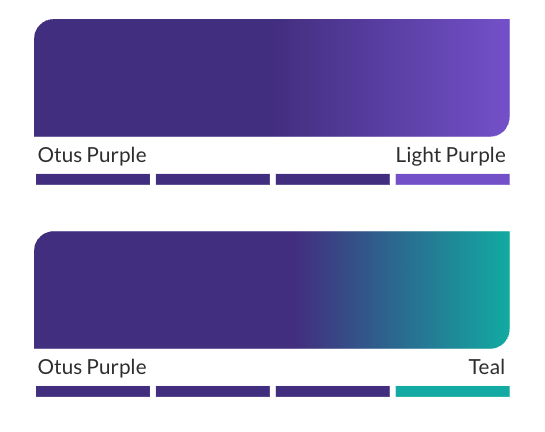
Our gradients should be used as accents in the design to help create visual interest and draw the eye in to important elements or for vibrant backgrounds.
Otus Purple will still dominate the gradients more than the secondary colors.

TYPOGRAPHY
LATO
Lato was chosen for its versatility, modern aesthetic, and legibility across various digital and print platforms. Its clean lines and balanced letterforms create a professional yet approachable tone, making it ideal for both headlines and body text.
MONTSERRAT
Montserrat’s geometric and clean design communicates innovation, technology, and education in a clean and professional way, making it perfect for titles that need to capture attention.
FONT AWESOME
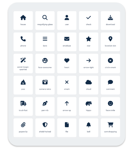
FontAwesome provides the icons for the platform and Otus marketing.
These fonts can be downloaded for free on the Font Awesome website.
When working in desktop applications, like Adobe Illustrator, Figma, and Canva, you can use Font Awesome as a typeface in any text area.

